Whether we like it or not, first impressions matter. Researchers at Carleton University in Ottawa have established that a website’s appeal can be assessed in as little as 50 milliseconds – not enough to appreciate well-written copy, but more than enough to entice visitors with amazing design.
Every marketer knows that eye-catching design can contribute to brand awareness and, by extension, to better conversion rates. But how can you boost creativity without diluting your message? In this interview, we get to know a bit better our Senior Creative, David Stokes, and learn his top-tips to create beautiful artwork that cuts through the noise.
How would you describe your approach to design?
I’m very methodical in how I approach most things – I have a background in engineering and have previously worked in print and packaging, where technical accuracy is all-important. This is especially true when dealing with products where there is no margin for errors, such as pharmaceuticals.
This attitude is reflected in my work – I like to make sure that I always have the formatting and brand elements in place, so the work will be consistent and on-brand.
Having a clear plan of how to approach work is especially crucial in motion graphic projects. Here, files can very quickly contain hundreds of elements on a timeline, and it’s important to keep track of how they all layer and interact.
My job often involves a lot of “trying things out” as I try to create interesting and attractive designs, often pushing the boundaries of brands in new directions. Once I have a solid artwork foundation, I know I can build on it without running the risk of producing graphics that look great but perhaps don’t work in a specific print process, or can’t be easily incorporated into a client’s brand style.
Is there a designer or style that you particularly admire?
I really like big bold graphics, so I’ve always loved work by the likes of The Designers Republic. Much of their work on early Playstation games and club posters in the 1990s still looks really fresh today.
I’m also a keen cyclist and see a lot of really strong branding in that field. Aesthetics can play a big part in the often expensive purchase of bikes, components and clothing, and appealing graphic design can be as important as technical product design.
Do you specialise in a particular kind of design or project?
I’m usually called on for technical projects where complex information must be conveyed as clearly as possible. I really enjoy the challenge involved in this, whether it’s producing detailed technical illustrations and explainer videos, or trying to combine a page of facts and figures into an attractive and clear infographic.
What are, in your opinion, the main benefits of hiring a professional designer, as opposed to DIY?
An experienced designer will have the know-how to produce the kind of high-quality output that shows off your business in the best possible light, and to do so consistently across a range of different media.
A cohesive aesthetic is vital to build the kind of brand value that strengthens a business – for example by having your website and emails match your brochures and press ads. Moreover, a designer will be able to advise on ways to push an initial concept into new technologies and formats you may not have considered before.
What are the design mistakes that you see more often and that you’d recommend clients stay away from?
Using the wrong software – or often an inappropriate medium entirely – to deliver a message. When we receive a brief for a specific job, we often need to take a step back and suggest a better way to approach the whole campaign. This can be as simple as swapping an untidy Word document for a designed PDF, or reimagining the whole project as a structured EDM marketing campaign.
I also noticed a tendency to cram as much information as possible into a design, resulting in a cluttered, unstructured output. This leaves readers without a clear sense of the offer and of their next course of action.
Finally, it’s important that clients maintain their brand consistency throughout everything they put in front of their customers. Cutting corners and producing sub-par design could de-value the whole brand.
Define ‘good design’ in three words
Look at this!
There’s a saying that good design should never say “look at me”, but instead “look at this”. That is, it should always point the audience to the information it needs, or convey the message the client wants to get across, without over-complicating or obstructing it.
Design is often required to shout and grab attention, but its core job is to deliver a clear, specific point. If we can do that while looking great and staying on-brand, this will ultimately strengthen the message, build trust in the brand, and allow the message to linger in the reader’s mind.
Do you need help to create amazing-looking designs that get the message across? Get in touch. Our designers will work with you and the rest of the Pod team for a truly integrated approach to your communication strategy.
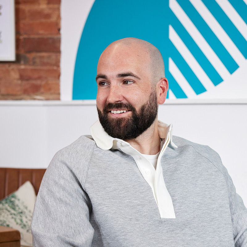
Part artist, part mathematician, David has the talent to create design assets for almost any application, from animated videos to high value print. Behind the cool, calm exterior beats the heart of a passionate creative whose dedication to detail makes every job easier.
Internal comms can be a tricky beast to tame. But whether your goal is managing potential issues, tracking shifts in sentiment or bringing your brand ...
So, you’re planning to start a B2B podcast? I’m all ears (and eyes, if you’re planning to film it too). It’s a smart move; B2B podcast production is ...


.png)


 James Montgomery
 Alexander Costello